Button Hover Effects for Squarespace
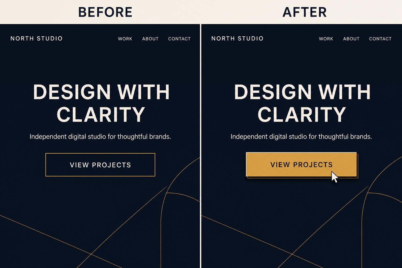
Button hover states are one of the fastest ways to make a Squarespace template feel hand built. This snippet gives you three tasteful effects for the standard .sqs-block-button-element class: a lift with a soft shadow, a color wipe that sweeps across the button, and a subtle letter spacing expansion. Each effect is an independent CSS block, so pick the one that matches your brand and delete the others. Pure CSS, any plan, and it covers all three Squarespace 7.1 button sizes.
The Code
/* Lifts the button slightly and adds a soft shadow on hover */
.sqs-block-button-element {
  transition: transform 0.2s ease, box-shadow 0.2s ease;
}

.sqs-block-button-element:hover {
  transform: translateY(-3px);
  box-shadow: 0 8px 20px rgba(0, 0, 0, 0.18);
}/* A fill color sweeps across the button from the left on hover */
.sqs-block-button-element {
position: relative;
overflow: hidden;
z-index: 1;
transition: color 0.25s ease;
}
.sqs-block-button-element::before {
content: "";
position: absolute;
inset: 0;
background: #c9974a; /* wipe color, change to your hover color */
transform: scaleX(0);
transform-origin: left;
transition: transform 0.25s ease;
z-index: -1;
}
.sqs-block-button-element:hover::before {
transform: scaleX(1);
}/* The label breathes apart slightly on hover, quiet and editorial */
.sqs-block-button-element {
transition: letter-spacing 0.25s ease;
}
.sqs-block-button-element:hover {
letter-spacing: 0.08em;
}How to Install It
- 1Go to Design > Custom CSS (Website Tools > Custom CSS on newer dashboards).
- 2Paste only the style you want to use (each block is standalone) and save.
- 3For the color wipe, set the background color in the ::before rule to the fill you want on hover.
Compatibility and Plan Requirements
Squarespace 7.1. .sqs-block-button-element covers standard button blocks in all three sizes. Buttons inside forms or the commerce checkout use different classes and are not affected.
This snippet is pure CSS, so it works on any Squarespace plan, including Personal, through the Custom CSS panel. No Business plan needed.
More Squarespace Snippets
View all
Want This Done For You?
If you would rather not touch code, or you need something bigger than a snippet, I build custom Squarespace features for clients every week: widgets, search and filter tools, integrations, and full sites.